|
|
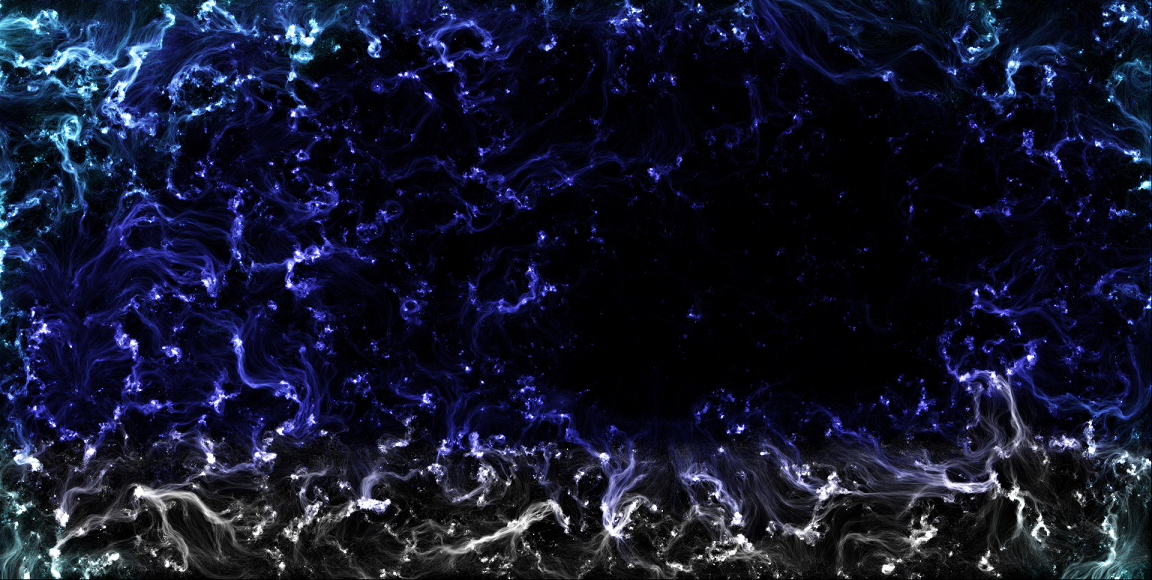
I've shown some of my Neonflames artworks on this site before (mostly sub 2MB because, attachment cap there), but here's what I've come to realise: the slower you move your cursor, the brighter the area. Case in point:

Last night I worked on this piece...
 bluesplash smaller.png
(1.63 MB, Download Count: 1)
Then this piece three hours later.
I have a few tips that'll help:
1. The standard palette workss pretty well, but if you want different colours, try tweaking the colours a little. Just make sure to remember the colour values to reuse that custom colour.
2. Again, the speed of your cursor with the mouse button clicked determines the vibrancy of your colours. The slower the mouse, the brighter the colours.
3. To create new colours without tweaking the default palette, simply pick your first colour and colour over the area you want, then take the second colour and overlap carefully.
4. If using Windows, be careful with the full screen because you could inadvertently cut away some of the artwork. I recommend the fullest screen possible while maintaining the window on a Windows PC. On a Mac, however, you might want to keep tabs visible in your browser (I prefer Firefox.)
5. Once you're done, rename your artwork when saving so you'll easily remember the purpose of your artwork.
Hope these tips help!
|
|
